I was doing some Kubernetes network policy training earlier this week for the Infosec team at a large retailer (hi, guys), and we started talking about the process of policy creation and the tiering capabilities available in Tigera’s solution set.
Before I dive in, let’s do a quick review. Tigera’s policy tiering solution is presented in our UI as a set of “swim lanes” where each lane is a policy tier. As an example, see below. In the UI, the order of precedence for tiers is left to right. The leftmost tier will be evaluated (in a top to bottom order). If any policy in that tier allows or denies the traffic, the evaluation will stop. However, if a policy ‘passes’ the traffic, it will be evaluated by the next tier in the hierarchy, working rightward to the eventual last, or ‘default’ tier.
Now, we’ve always talked about the higher priority tiers being more top-down, conceptual, and strategic in their scope. This is where you would put the compliance and infosec policies that enforce broad corporate policy goals such as:
- Data sovereignty requirements
- PCI / SOX / HIPAA / GDPR / ITAR compliance
- Broad controls about what protocols are allowed into or out of the environment (i.e. no use of external DNS servers, no FTP or Telnet, etc).
As you work right-ward, the policies become more tactical, bottom-up, and concrete in their scope. This is where you start seeing policies that control things such as:
- Tenancy
- Dev / QA / Prod
- Data replication
Eventually leading to the very concrete and bottom-up policies that define the actual allowed flows between the various microservices that make up the application environment.
A corollary of what was mentioned before is that the policies to the left should infrequently change, becoming more dynamic as you move rightward across the swimlanes. If you were to graph this, it would look like there would be two opposing exponential curves. One that is climbing toward infinite to the left and zero on the right that maps the ‘strategic’ value of the policy, while the opposing curve, high on the right, and low on the left would represent the rate of mutation of the policies.
There is a problem with this model, however. Where do you put the reactionary, broad-scoped, or break glass policies that you need to respond to incidents or enable contingency operations?
Just like you would never number your router ACLs 1. 2, 3, etc. but instead 10, 20, 30, etc. to leave room for the un-planned rules that need to be inserted, you should make similar arrangements in your policy tiers.
Therefore, we come to the graph that I drew on the whiteboard earlier this week, and which I recreate (in neater form) for you below.
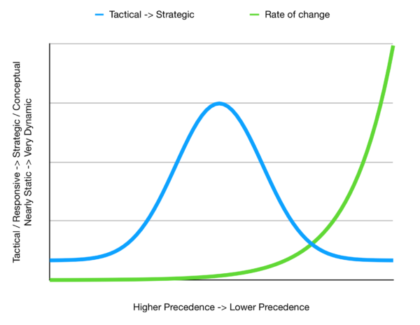
There are two superimposed graphs here. If we overlay this on the UI snapshot above, the leftmost swim lane would be on the left axis of this graph, and the rightmost (or default) swim lane would be to the far right of this graph.
In this model, the left-most swim lanes are left for contingency or incident operations. They may hold pre-positioned policies that are well planned out and only require labels to be applied to external or internal endpoints to become active, for example:
- A policy that quarantines any endpoint that has the label quarantine = true applied to it.
- A policy that blocks all traffic sourcing from one or more address ranges that are labeled with a black hole = true
Other policies may exist here that are part of your pre-planned out DR or contingency operations plans. As an aside, you do have those and practice them regularly, right? Finally, other slots here are for the policies you don’t know you need yet, but you will discover the urgent need to write them some very early (03:00) morning.
The middle lanes are reserved for the compliance, continuity and proactive infosec policies. The rightmost lanes are reserved for operational and development driven policies.
With that in mind, the blue curve measures the relative tactical / concrete / bottom-up to strategic / conceptual / top-down weight of a given policy, with the higher strategic content leading to a higher value. The green curve measures the relative rate of change policies themselves. Not how frequently they get used, but how frequently they get changed.
I’m not saying that this is the only way to lay out a policy tier model, but it is one that draws on having to do way too many contingency operations over the course of my career, and knowing that there will always be an (unpleasant) surprise waiting around the corner.
————————————————-
Free Online Training
Access Live and On-Demand Kubernetes Tutorials
Calico Enterprise – Free Trial
Solve Common Kubernetes Roadblocks and Advance Your Enterprise Adoption